Thursday, 11 December 2014
Tuesday, 25 November 2014
Magazine Masthead in progress
I have started to create my masthead for my magazine using illustrator. I will manipulate this masthead by changing some features of the font to make it my own font and make it original.
Sunday, 23 November 2014
Double page spread in progress
So far i have only managed to complete half of one page. Once i finish typing out the article i will adjust the size, colour and font to make my double page spread look more appealing. I will add a larger size letter 'T' at the very beginning of the article where it says 'this' as it is a convention of a magazine double page spread to start the article with a bigger sized letter.
Saturday, 22 November 2014
Friday, 21 November 2014
Thursday, 20 November 2014
Illustrator image trial and progress


I used the magnetic lasso tool to crop out the background around my model in order to achieve this blank white background. I then had to drag the image onto an A4 page as my magazine will need to be on an A4. This had to be done as when i took the picture, i took it landscape however it has to be portrait. I selected 'float all in windows' then dragged the image onto a blank A4 page. I inserted rulers to the boarder of the page as this will help me make sure my features and fonts don't go off the page or too near to the edge of the page. Using photoshop tools such as the magnetic lasso too and the hue and saturation, i edited the colour of my models eyes. Previously it was hayzel however i changed this to a shade of blue.
Illustrator masthead trials

I used Illustrator to produce different trials of mastheads ideas. These will not be my finalized masthead ideas however it has helped me familiarize myself with the programme. At first i found it difficult to work myself around illustrator however once i got the hang of the tools needed, i found it easier. To help me navigate myself around i watched youtube tutorials which showed me what tools are used to achieve certain objectives.
Friday, 14 November 2014
Magazine proposal pitch
This is the magazine proposal which i pitched to my class. I received feedback from my teacher and peers. There were few points which i missed out however my tutor asked me questions which answered. From the feedback i received the audience helped me decide to name my magazine 'Mayhem. Also they chose the font which they believed went well with my genre for my masthead. I believe my proposal was well written however whilst presenting i did not mention everything which i wrote about in the propsal.
Monday, 10 November 2014
Saturday, 1 November 2014
Visit to the photography studio
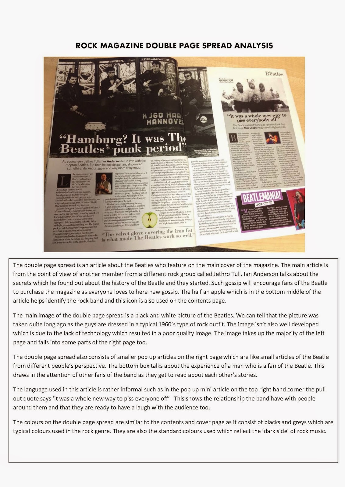
Before i begin the photoshoot i need a clear plan of what im going to be doing-
- need to be aware of who are my models
- what costumes/ clothes are needed
- What props may i use?
- What kind of makeup is going to be used
- plan the timing, have the models ready before shoot time begins
`
The camera i will be using is the DSLR Nikon D7000. It is around 17 million mega pixel which means it has very good resolution. The lens of the camera is 18-135.
As soon as you hear a beep from the camera, you are in focus. On the lense, 'A' and 'M' are used for zooming. A is for auto mode which is used for portraits, eyes or nose on focus or where the background is in or out of focus. M is for manual. If you want to have the hair of a person in focus or the actions of someone jumping in focus, have the settings on s which means shutter priority.
Reflectors come in different shapes and sizes and they are used to bounce the light. There are gold and silver reflectors, gold gives a warmer tone.
If i choose to use a white backdrop, it is best to avoid photoshopping this. There is enough space of backdrop for group shoots or selfies so i dont have to be concious by limiting the space.
Always have my model placed 5-6 feet onto the backdrop. Never have them standing right at the back as this will bleach them into the backgrounding, vanishing half of their image.
When photographing i will have to ensure all the class lights are turned off. There are specific photography lights which i will be using. The studio flash will not affect the image of the model. It is suitable for photoshoots and will not cause the model to sweat or loose colour in the image.
Everything in the studio is infrared. Click flash on the camera to check if the flash is working properly. The settings of the flash can be changed, 1 being the lowest setting and 6 being the powerful spurt.
The main light which will be used is the key light. Position this on the individual model. Phill lights are used to take out the shadow whereas haline lights shines on the back of the model, separating them from the backdrop. This creates alot more contrast. The lighting ratio is 3:1 which means every light will do something different in terms of flash.
Thursday, 16 October 2014
6. Drafting + finalzing house styles and layout (Planning your music magazine)
AUDIENCE + GENRE
House Style - Consistent style element
(Genre) - Masthead (Design ideas, try a few out & make notes about what you like)
- Font
- Colours
- Layout
Proposal - Outline of your idea
- Include as much detail as you can
- You can ask the class for feedback during the bitch
- What music genre?
- Who is the target audience?
- How can you use your case studies? (Is your audience similar?)
- Who is or could be your publisher?
- Price?
- How often will it be released?
- Distribution methods? (Magazine app/ website)
Monday, 13 October 2014
Distribution of magazines & News stand layout
Adults and kids magazine are placed separately on the news stand. The adults magazine are up on the higher shelf whereas the kids magazine are on the lower selves in-line with the height of small children who can easily make eye contact with them. The purpose to placing children's magazine at their eye level, attracts their attention which eventually leads to the parents purchasing the magazine for them. The kids magazine consists of bright bold colours such as pinks, oranges & blue. This the childrens attention as the colours are very striking and bold. Some magazines come with free gifts which is wrapped in a glossy package. This draws in the audience as everyone loves freebies.
The magazines which are more popular are placed at the front whereas rest of the magazines are placed on the back of the shelves. The magazines are placed in a row, one over lapping the other which means parts of the magazine are not visible. However in most the magazines the visible areas is the left side of the magazine. You can see parts of the magazine masthead on the left hand side before its covered up by the next magazine. By being able to notice sections of the magazine masthead the audience should be able to gather what magazine it is.
Distribution of networks- Every publisher has its own distributor who let out the copies of magazines from the stages of being made till the point it is sent out to the retailer. Magazines are normally found in super markets, newsagents or newstands.
Freemium, Direct distribution- Freemiums are when you give away free issues. This encourages readers and buyers as everyone loves a little of free goodies. This is a mainstream method of distributing magazines now days to get the magazine out to the public. For example, outside train stations, there are usually people giving out free magazines. This helps make a profit from the advertising.
Sales or return- This is a method used by many companies where the copies which were unable to be sold can get sent back to the distributor. This doest affect the costings of the newsagent/new stand or the company as it is free of cost however it can be not so environmentally friendly as copies may go to waste.
Ezines- Ezines are electronic distributions of the magazine. It usually is just aversion of the magazine online on a website or an app. Ezines contain videos and hyperlinks which can extend the articles further. Now days ezines are very popular as everyone can easily search up the latest news they want to learn about for free rather than paying to buy issues of magazines.
Postal subscription- Regular magazine readers may subscribe to the magazine to have it posted to their door at discounted price. This is a good method as it mean the reader will be hassle free and does not have to worry about purchasing the magazine from the shop whereas it is handed right to them. It also means you will not miss any issues by mistake or fall behind on the issues of magazines.
Sunday, 12 October 2014
Evaluation for the college magazine and contents page.
As part of the assignment, I was asked to create college
magazine cover and contents page aimed at students within my college. I used Photoshop
to successfully create the magazine and contents page then I received some
feedback from others on what went well and what to improve.
First of all I had to create a plan of the magazine and
contents page on Microsoft word to give me a rough idea of what it would look
like. This would also make it easier for me to lay out the magazine on Photoshop.
Once I had the pages planned I went around the college to take some photographs
for the cover page and contents page. I had to make sure the images taken were relevant
to the magazine genre and they were well photographed. The photos I took were of
students in Leyton Sixth form either studying in the street or in the library.
The image used on the front cover was a medium angle shot of
two students looking into their work. I used Photoshop to manipulate the image
and make the background brighter by changing the hue and saturation setting on
selected area which made the two student stand out even more. I sent this image
behind all the texts and other icons which made it look like a professional
college magazine. The fonts I used for the cover story are bold and the colours
of the fonts contrast well to the background. The cover line use of ‘college
giveaways’ will draw the reader’s attention as I included images of an ipad
that students will want to win.
I included icons of social networking links such as twitter,
Instagram and Facebook which are well known and most frequently used amongst
the young students. This is a popular convention on magazines which I successfully
portrayed as it will spread the word of the mag. Also students can keep up to
date of the latest college new through the apps linked to the magazine. I
included the college website which is clear to read above the masthead. My
magazine includes typical conventions of a magazine such as the barcode. In most
magazines the barcode is found on the bottom right hand corner which is why I placed
the barcode there too.
My magazine is only 40p for only 40 pages which goes to show
you will receive exactly what you are paying for. The magazine is cheap and
affordable, literally making it 1p per page. To improve on the magazine cover I
believe I need to experiment with fonts for the masthead as it doesn’t really
stand out in contrast to the cover lines. I should try playing around with
different font colour for the masthead and experiment with the thickness of the
font. Also I should try experimenting with the layouts of the cover lines and
place them where appropriate. I personally believe I need to include more cover
stories which will attract the audience’s attention.
The second part of my task was to create a contents page
which I believe I was successfully able to do however I think my contents page
was far too brief and simple. I created the contents page on Photoshop instead
of InDesign as I found Photoshop easier to use. The image on the contents page
is of a student directly looking at the camera, in the college library.
There is two parts to the contents page, the features which
include the special articles of that issue and the ‘every month’ articles which
are basically things that are found regularly on every issue. I could develop this
page further by manipulating the image used further such as experimenting with
the colour of the image. Also I believe more images are needed on the contents
page to make it look stronger. I should also try play around with the fonts and
colours scheme of the text. One of the mistakes I made in this content page was
I didn’t include the cover line ‘college giveaways’ which was on the front
cover of the magazine on my features section of the magazine. This was
important to include as if students are looking for that page on the magazine,
they would be able to find it on the contents page therefore have to look
through the whole magazine.
Saturday, 11 October 2014
XXL media press kit
I found the 2012 media press kit for XXL on http://www.americasmedia.com/mediakits/XXL%20MediaKit.pdf. This press kit allowed me to see the statistics behind the magazines potential buyers and readers such as the popular age group that reads the magazine and ethnicity etc. From the study i found out majority or male read this magazine compared to only 22% of female. There is a large number of African-Americans who read this magazine which may be influenced by the hip-hop artists who feature in the magazine articles. 83% of the readers are aged 21+ with a majority of 29% who are aged between 25-29 years old.
Friday, 10 October 2014
Thursday, 9 October 2014
Wednesday, 8 October 2014
Sunday, 5 October 2014
Monday, 22 September 2014
Questionnaire
Questionnaire
1)
Do you think the article looks
appealing overall?
________________________________________________________________________________________________________________
2)
Is the font and size of text
suitable?
________________________________________________________________________________________________________________
3)
Do you think the article needs
more images and colour?
________________________________________________________________________________________________________________
4)
Would you suggest others to read
the article?
________________________________________________________________________________________________________________
5)
State two changes you would make
to the article?
________________________________________________________________________________________________________________
6)
How much would you pay for this
magazine article?
________________________________________________________________________________________________________________
7)
The target audience is 16-25 year
olds. Do you think it’s suitable for this age range?
________________________________________________________________________________________________________________
8)
Do you think females would share
any interest in this article?
________________________________________________________________________________________________________________
Evaluation
Evaluation
I created a magazine article
which supports the idea whether it is wrong or right to be downloading free
music from illegal sites and apps. I researched into both for and against the
aspect of free downloads and used statistics and facts to back up my findings.
To support the point of view which is against downloading free music, I used a
quote of a real music artist. I also used statistics to shows the wide scale
number of piracy downloads which occur and how that number is increasing incredibly
fast.
Once my article was created, I
produced a questionnaire which I handed out for some feedback. I asked
questions like ‘is the font size and text suitable’ & ‘do you think the
article looks appealing overall’ etc. The feedback I received told me that the
size of my font needs to be a lot bigger so it would be easier for the audience
to read. Also I should try experimenting with the colour scheme and play around
with the font. The positive thing about my article is that it looked rather
professional and was well layer out. Also people thought the context within the
article was interesting to read as they found out few things they didn’t know
and said they would suggest others to read. I asked the audience how much they
would pay for the article and prices were ranged from 50p to £2.00.
Sunday, 21 September 2014
Subscribe to:
Posts (Atom)